I just got back yesterday from a week at Trent River Cottages, a beautiful little place right on the Trent River. If you live in Ontario, Canada (and even if you don't) you need to consider visiting this little place. Yes, I'm doing some blatant advertising, and no, I'm not getting paid to say these things. ;) I created this layout while at the cottage and the beauty of it is that the photos that I will put on it I took just an hour before. Perfect! Here's my layout:
I had so much fun looking through the few supplies I had with me to create this layout, and to match it to my photos. I knew it would be a challenge, only a few Workshop-on-the-Go kits and that yummy new Burlap ribbon to work with. Here is a close up of each page and then I'll explain what I all used.
I went through a couple paper packets and chose papers that were all in the "brown" family, adding a pop of red. I know the neutral shades will really make my photos shine. The top almost flowery piece is from Clementine and the others are from Scholastic. I also pulled cardstock from the paper packets as well. The bases are our new Cashmere, the dark cardstock strips are Saddle and the title and journaling squares are Champagne. The red cardstock is our new Ruby.
I followed a pattern from the new publication Make It From Your Heart to cut the paper. Then I sanded the life out of every piece. Those Colonial White pieces will be removed and replaced by my photos. Haven't had a chance to get them printed yet since, as I said, we just got home yesterday. I used the Clementine WOTG stamp set to stamp the 3 sentiments in Cocoa, and I think they work perfectly for my layout. The title is stamped in Cocoa with the Trinity alphabet.
Here are a couple close ups of how I used the burlap ribbon.
I have to admit, this ribbon is one of my absolute favourite new products! You might think that's a bit strange given things like the new Cricut cartridge and amazing paper and stamps, but it's true. I've been looking at burlap ribbon for a while and thinking I needed to purchase some and just before I do, bam, there it is in our new line up! I almost jumped out of my chair! For this layout, I glued some to cardstock and then cut the three banner pieces. For the ruffle, I actually cut it in half lengthwise because I just didn't have enough space at the bottom, especially since I didn't have my photos yet. Initially, I had folded it in half and then attached it, but it was just too bulky, so I cut it instead. I absolutely love how it looks and I can't wait to play with it some more! I popped on some square Durables and I was done.
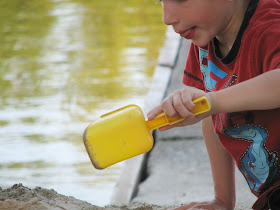
You can hop on over to Julia's blog to enjoy more new product artwork, but if you'd like to hang around and take a peek at the photos I'll be adding to this layout, just scroll down. I love showing off my kids, after all. :)
Thanks for sticking around to take a look. Hop on over to Julia's blog and enjoy.
Happy Creating!


Great mix of papers for your layout! The neutral pages are really going to make those adorable photos POP.
ReplyDeleteLOVE your layout! I'm in awe when people mix the paper packs together :)...beautiful!!!
ReplyDeleteCute layout! Adorable kids!
ReplyDeleteLove you pattern mixing! Thanks for sharing!
ReplyDeleteGreat layout - I love how you incorporated the burlap ribbon!
ReplyDeleteLove what you have done with your layout - pattern mixing, burlap (and lots of fun memories)! Thanks for sharing with all of us.
ReplyDelete