Monday, January 31, 2011

CTMH: February Stamp-of-the-Month Blog Hop

It's time for another blog hop with our fabulous February Stamp-of-the-Month, Friendship.  This month we have such a classy stamp set, full of damask images to create beautiful, classic, sophisticated artwork.  If this is your first time experiencing the blog hop, just grab a cup of your favourite beverage and a snack and settle in for some stunning inspiration with this stamp set.  Just click the link at the end of each post to take you all around this circular hop.  When you end up here, you've hit them all.  If you've come here from Debra's blog, you're on the right path.

Here is my card:


Did you know that Grey is the new Black?  I love how it looks with a pop of Cotton Candy pink on this card.  I'm going to have to use it more often.  I was tempted to make another one with Blue or Green sparkles, but I ran out of time.  The grey is looking a little black in this image, and the sparkles are a little washed out.  I apologize.  We're painting my workshop space and I couldn't find what I usually use for backdrops, forcing me to resort to other methods.  You'll have to imagine things are brighter.
I used my favourite image from this set and stamped it numerous times right on the card base, using Grey Flannel. Then, using the same colour, I stamped the sentiment and matted it with the back of one of the papers from the new Sweetheart Level 2 paper pack.  I went all out with the pick sparkles.  I love those coloured sparkles!

Here is the inside:


The damask image is stamped in second generation, with a couple more sparkles on it.  What a lovely sentiment that is!

Here is a card one of my team members created using the Wings paper pack:


So pretty and elegant, and I love how the big image stamped on the envelope just has that "old-world" feel to it.  Great job, Tonya!

Now, it's time to hop on over to Georgia's blog and check out the gorgeous artwork she's created with this set.  Thanks for stopping by.  And please, leave Tonya a little love and tell me what colour you would pair with Grey.

Happy Creating!


Friday, January 21, 2011

CTMH: Oh, Our Ink!

Today is going to be a short one, my last post in this fun "Freebie Week", as I have dubbed it.  Still not sure what that means?  You've got until midnight tonight to ask and find out.

I love our stamp pad design.  Did you know that in order to keep your stamp pad surface juicy, you should store the ink pad upside down?  Well, CTMH has solved that by putting the ink pad in the lid!  Fabulous and innovative.


I love that the stamp pad opens up and flips inside itself.  I know some people have a tough time opening and closing the stamp pad.  I discovered a neat little trick that another consultant shared with me.  Slide your thumb nail in the little opening as you open the stamp pad to help it pop open.

Would you like to hear what else I love about CTMH's stamp pad?  I love that it's raised higher than the base it sits in.  It makes it easy to stamp with big stamps (no lines), edge distress, and even do this neat criss-cross technique that I wish I had time to show you.

What about the actual ink, you ask?  Well, except for a few, they are all water-based, dry super quick, and match all the rest of our products in the 60-colour palette.  It's pure perfection.

But, of course, you already love the Close To My Heart stamp pad, so that means you're going to love emailing me to tell me that stamp pad is the key word for today.  You might just benefit from that...

Thanks for joining me on this fun week.  I hope you've learned something and gotten something you can take away with you.

I'll be back with more artwork next time.  Happy Creating!

Thursday, January 20, 2011

CTMH: Re-Inker Isn't Just For Re-Inking

Oh, what fun I'm having posting every day this week.  Have you taken advantage of my special week, yet?  Email or call me to find out what's so special about these posts.  But don't wait because it's over tomorrow!

Today, I'm going to give you a bit of a sneak peek at some brand new paper that you will be able to purchase beginning February 1st.  I've also had lots of fun with re-inker.  What is this stuff?  Well, it's a little bottle used to add ink to your ink pads once that nice juicy feel goes away and your images aren't inking up nicely anymore. Instead of buying a whole new ink pad (What do you do with the old one, anyway?), just purchase a bottle of re-inker.  It will last for a LOOONG time if that's all you use it for.  But did you know that re-inker can be used for lots of other things, too?

I made up a little tutorial (my first one!) to show you how to use your re-inker to made your own little ink pad, called a puddle pad.  First, choose two or three different colours of re-inker that matches your paper.  I've only got two because I'm only just starting to learn about all the neat things you can do with re-inker so I don't have too many colours yet.  I'm using Smoothie and Cocoa.  You'll also need a few baby wipes, folded and placed in a tray.


Start with the darkest colour and just put drops onto the baby wipe, making sure you're covering an area large enough for your stamp plus a bit.


Then add your other colours, darkest to lightest.  Don't worry if there's some empty spaces between the drops because they'll all blend together.


Then stamp away.  Move your stamp around a tiny bit to get some more blending of colours.  Here you can see my three different tries.  Neat isn't it?


Now, you're ready to add it to your project.  And you're also ready to see the next thing you can do with re-inker!

We have a fabulous new product called the spray pen.  It's such a neat little tool.  You can mix water, re-inker, and Create-a-Shade Pearl Paint to spray a wonderful shimmering mist on your project.  In the following photo, you can see that I've already added water and re-inker to my spray pen.


When you add the paint, your mixture will look lighter.  How much of each you add is up to you.  Use the lines on the side to help you.  One suggestion is to add water until the 7th line, re-inker until it reaches the 9th and 3 drops of paint.  That creates quite a bit of mixture so if you're just using it for a small project, just use less.


Then spray your project.  Make sure you protect your work area and even practice a bit on a scrap piece of paper so you know how hard to press for the effect you want.  I covered the back of my card as well.


And here is my assembled card.  I love the finished product!


The re-inker just added such a nice polished look to my card.  I used paper from the new Mayberry Level 2 kit.  It might be my favourite from the 8 new paper packs in the new Idea Book!  I used the January Stamp-of-the-Month, which you can still order.  I  used my craft knife to cut around the top wing and pop it out a bit.  You can see that in the next photo.  I added some Mocha Opaques and my card was finished.  See that wonderful shimmer?
 

So, use your re-inker for something special and tell me what you did.  I'd love to learn some more neat techniques.

Still don't know why I keep bolding some words?  Ask and you shall know...
Happy Creating!

Wednesday, January 19, 2011

CTMH: Chipboard Should be Called Fun-Board!

Okay, I know that title is a little silly, but I love chipboard, and I especially love CTMH's Dimensional Elements Hearts.  My problem is I forget to use all the fun chipboard shapes I own.  It's silly, really.  I was going back through the photos of all my artwork I have taken and only a few actually have chipboard on them!  What's wrong with me?!  Maybe this post will help me use up my stash.
Close To My Heart has created white chipboard which means you can leave it as is, or do just about anything else to it.  This layout, which I posted about a half year ago, has lots of ideas for how to use Dimensional Elements Hearts, or any shape.


I've covered a circle with paper and then added dots of Liquid Glass, inked up two flowers with a brayer and then removed some layers so they're not too thick and then stamped and added a rub-on, inked up an embossed bracket so a pattern shows through, added 4 different colours to a letter and blended them together a bit, scored and inked up a heart to turn it into a journaling space, and inked and distressed a book plate.  Wow, that's a lot of different things you can do with your Dimensional Elements Hearts.  And since we're focusing on hearts, here's a card I where I used another one.


Perfect for Valentine's Day, which is fast approaching!  Maybe I should use up my  Dimensional Elements Hearts for cards this year.  What will you use your's for?

Curious about all the bolded words?  There's a reason.  But you'll have to call or email me to find out...

Happy Creating!

Tuesday, January 18, 2011

CTMH: Mix It Up!

Today I want to talk about Close To My Heart's Mini-Medley Accents.  They are so much fun to use and make accessorizing (is that a word?) your cards and layouts a breeze!  Especially if you combine a couple colours together.
There are a couple things that are helpful to remember when you're working with embellishments.  First of all, ground them somewhere on your project.  Give them a place that makes sense and connects with the other parts of your project.  Notice where I placed those buttons on the card below?  Right on the edge of the image and over the twill ribbon.  They connect those two parts together.  Putting a row of brads, from your choice of one of the Mini-Medley Accents packages along the edge can often draw the eye to other similar


Second, you'll want to think in terms of odd numbers.  This is a rule that applies all over the place, in art and even interior decorating.  Odd numbers are more pleasing to the eye.  It goes back to how creating was made, odd numbers in flowers and leaves.  Beautiful.  The layout below has just 5 flowers.  This is a layout I made a while ago.  That's my mom, isn't it gorgeous photo?


What is in a package of Mini-Medley Accents?  They include a variety of embellishments, all in the same colour.  Depending on which colour of Mini-Medley Accents you choose, you could get brads, buttons, ribbon, photo clips, metal tags, book plates ... and they all match the CTMH colour palette exactly.
How do you use the Mini-Medley Accents on your layouts?  Have other "rules" to remember as you create?  Share them.  I'd love to learn from you, too!

Curious about all the bolded words?  There's a reason.  But you'll have to call or email me to find out...  In the mean time, happy creating!

Monday, January 17, 2011

CTMH: A Wonderful Gift

I just had to share these two projects I created for my mom and dad.  This was a workshop I held in December.  We used a Level 1 Kit to decorate up a 6x6 My Creations Memory Showcase Accordion Album.  I took my favourite photos from this year and created two albums, one for each of my kids.
The first 6x6 My Creations Memory Showcase Accordion Album is all about my daughter.  I used the Splendor kit, as well as a Colonial White Mini-Medley and the set of brads that match the Splendor paper (can't remember what they're called right now!).


I added some Liquid Glass as well to this 6x6 My Creations Memory Showcase Accordion Album, although it's hard to see in these photos.  I apologize for not having a good photo of it all unfolded, but I took these photos quickly before giving them to my parents.  I actually had to unwrap them to take the photos!  Yeah, I was really thinking there.

Here is the second 6x6 My Creations Memory Showcase Accordion Album that I made with my son's photos.  I used the You Rock Level 1 kit and Outdoor Denim Mini-Medleys as well as a bit of hemp here, too.


 I had fun adding Glitz Glitter Gel and Liquid Glass to this 6x6 My Creations Memory Showcase Accordion Album as well.

There are other things you can do with the 6x6 My Creations Memory Showcase Accordion Album.  If you turn it the vertical way, you can create a wall hanging, or cut the 6x6 My Creations Memory Showcase Accordion Album apart and just use the front and back chipboard covers that way as well.

Curious about all the bolded words?  There's a reason.  But you'll have to call or email me to find out...

Until tomorrow,
Happy Creating!

Thursday, January 13, 2011

Christmas Club Layout: Our Imperfect Tree

We have a fake tree.  It was a difficult decision, but when Nathaniel was just over a year, he was into everything and I had visions of pine needles being spread all over the house.  We found one at Michaels, discounted because the lights didn't work.  The great thing is, the tree never had any lights!  Something written on the box got us a great deal.  Hee, hee!
This year our kids really got into decorating our tree, which resulted in a far-from-perfect tree, but I think it turned out beautifully.  Sure, all our little snowmen are hanging on one branch.  Sure, a pile of ornaments are facing into the tree instead of out.  And despite the fact that one string of lights stopped working just hours after we finished, I really did love our tree.


This layout is the one my club made last Friday.  I love the way it turned out.


The tree is made of 1" strips of paper that were cut on diagonals in different lengths.  I purposely put them in the wrong order and a little on edge because of my imperfect theme.  Even my journaling is a little imperfect, although not on purpose!  We used the Mistletoe paper pack, some sparkles, Glitz Glitter Gel, the October Stamp-of-the-Month (Sharing the Magic), and lots of ink distressing in Cocoa. 


The title circle was cut and embossed using my new Nestabilities, and then popped with 3-D Foam Tape.


The little white spots on the above photo shows the Glitz we added for more bling!  Don't forget to do a layout about your tree, no matter how perfect.

Happy Creating!

Thursday, January 6, 2011

CTMH's Memory Keeper Gift

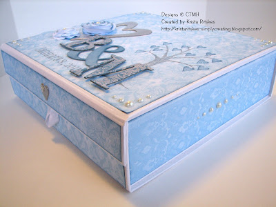
I really wish I had gotten one of these before now.  They are now retired and no longer available and the one I bought for my own cards I decided to do this with it.  I really do love how this turned out and I'm more than happy to be giving it away.
A couple in our Bible Study group is getting married on Saturday.  I made a 9x9 Accordion Album for some of their wedding photos and their invitation.  The Memory Keeper was the perfect place to house it.
Here is the album (Don't forget you can click on each photo to see them larger):


 And here are a few photos of the Memory Keeper:


There are a lot of Pearl Opaques and silver embossing.  The chipboard letters on the top of the box are K & Company.  The glitter was already there; I just inked them up in Indian Corn Blue.  The paper flowers were made with Tracey Mason's help and the ribbon flower is made from White Daisy grosgrain.  I used lots of different stamp sets (including the new E-sized alphabet!) and sponged just about all the paper in Indian Corn Blue, since that was the colour in their invitation.  All the patterned paper is from Magnifique.  I just used the backs for a nice mono-chromatic look.

Thanks for checking out all these photos.  I'd love to hear what you think!

Happy Creating!

Wednesday, January 5, 2011

Blog Candy Winner!

Congratulations to Sharon Luff for winning our blog candy.  Email me your mailing address and I'll put those 10 cards in the mail.